
🎨 Thirteen Questions with Cover Artist Sarah Dyer
Born and raised in the US South, Sarah Dyer escaped as soon as she could and found herself in sunny L.A. Along with falling into a career in UI/UX design, she sang in choir, made Comic Con buddies, and went to as many concerts as she could afford. After a certain worldwide event swept Sarah north to the Windy City of Chicago, Sarah is still trying to figure out how to Mad Men from home and retire early so she can work on things like queer lit presses, painting, reading, writing, cooking, and gardening.
Space Fruit Press: What’s your background?
Sarah Dyer: I was an art major and concentrated in graphic design. After school, I did some soulless production work recreating “art” from cardboard boxes (excuse me, corrugated) for making printing plates for various box manufacturers. It was drudgery, and I eventually quit to do some contract work for a while to figure out what I wanted to do next. I ended up falling into UI (user interface) design, and found a great team and art directors who taught me all about UI and UX (user experience) design. So that’s what I still do now. It’s sort of a niche skillset, but also broadly applicable, and growing, and it pays well since every tech company needs designers.
SFP: How do you work?
SD: Great question! I’m still figuring that out. In the past couple years I have become well acquainted with the term executive (dys)functioning. I’m all about organizational systems and routine… but also changing things up and switching to new tools as needed to help me focus. My current favorite desk item is a sticky notepad that says “Today’s Top 3,” and I just list what the day’s priorities are. It’s done wonders for helping me prioritize and let myself off the hook if I’m less productive or struggling on any given day. I take breaks to eat, drink, water my plants, water my kitties, chase one of them around with the dreaded brush, do the laundry, etc etc.
Okay Sarah, but how do you work? I have a Leuchtturm notebook where I write everything down. To do lists, notes, schedules, etc. Most used digital tools: Notion for documentation and tracking projects, Figma for design (both for main job and for SFP design work. I love a good pen, and have been experimenting with fountain pens recently, but these Muji pens are still my favorites.
SFP: What does your ideal work space look/feel like?
SD: I work from home, and I’ve set up about 3 different workspaces so far in our current apartment, but I still keep jumping from desk, to couch, to loveseat, to the dining room table, and back again. I like a lot of natural light, which we are lucky to have in abundance in our current space. I also have lots of plants now— typical millennial. I actually have a huge architect’s table and a kneeling chair for my current desk setup, and I work with my laptop and an external monitor. It’s really nice to have a big screen for doing any kind of design work. I also need some good background music. Ideally, I love when a friend comes over and we can both be working, since body doubling really helps me when I am feeling blocked/unable to focus on work. I also think I would prefer having at least three different office chairs to switch between, so my limbs don’t experience the same strain over and over whenever I get focused on a task.
SFP: What themes do you pursue for cover art and/or design for SFP?
SD: I try to work with the author to pull out visual themes from each story. We talk about tone, and what look/feel we want to go for, and then I start pulling in imagery and typefaces that might work to convey the genre/setting, and we go from there.
SFP: Where do you find your inspiration?
SD: For this last anthology Binary Stars, I did a lot of looking at old pulp sci-fi novels, which was super fun. I don’t do a full inspo board for each book, but for the big anthologies I like to go a bit deeper into the research. I really want to make sure the cover is representative of the good work that the authors are doing. We ended up going with a slightly different direction with the cover, but that was still fun and inspiring research.
SFP: How have your life experiences influenced how you approach the art for SFP?
SD: This is an interesting question. I feel like my career has definitely influenced me in my current approach: keeping things simple. I know that deep down I want to go off and hand paint every cover in oils or do a hundred sketches before picking a direction, but it’s just not realistic. Also my career in UI and UX has highlighted to me the importance of accessibility and legibility. People foremost need to be able to read the title. If I get too fancy with the type treatment, I’ll alienate a subsection of our audience who can’t read small type, or are color blind, or are turned off by an inapproachable cover.
Ironically, one of the tenets of design is that “people don’t read.” Clearly we are hoping they do, but we also know that our audience does read, and that they enjoy it. But the sentiment is more that graphics need to instantly convey what you want to communicate. Obviously on the book covers, it’s the title foremost, but also the feeling and the associations we want people to make.
I try to keep it classy, keep it simple. I don’t want my covers to distract or turn folks off before they open the book to read some really great queer romance.
SFP: What are the top five things you keep in mind when designing a book cover?
SD: The biggest things are: the look and feel of course, but also balance and legibility. I have to remember that these covers will be seen as thumbnails on a low-res black-and-white Kindle screen— and they need to stand out from the other books on that digital bookshelf. But they should also reflect the stories themselves, the genre, the setting, and the characters.
SFP: How do you know when a design for a book cover is finished?
SD: This is honestly the hardest part of design, or art in general. A lot of it comes with experience, but it’s also about that deadline. It’s one of those kinds of work that, for me anyway, always expands to fill whatever space it’s given. I like to do at least 3 or 4 rounds of editing with feedback from the SFP team or other design friends. That can take anywhere from a week to a month, or more. I could fidget with various designs forever, but I also have to be mindful of how much time I’m spending on them. I’m one piece of the production pipeline, so I can’t take too long on each cover.
SFP: If you could make a book cover using any medium, what would it be?
SD: What don’t I want to use? I’ve been using images + typography only so far, but my dream is to get more hands-on and do some drawing/painting at some point. Really it’s just my bandwidth that’s the limiting factor. I’d love to spend hours and hours on each one, but I’m trying to be economical with my time and with our current resources.
SFP: Do you have any favourite cover(s) that you’ve designed?
SD: Oh gosh that’s hard. I was quite pleased with how the individual story covers turned out from Hat Trick. That was a fun project since we wanted them to each have their own cover of course, but still have them relate together visually. I did the first mockups of those while I was working on the anthology cover itself, since I knew we would probably want to use the same images for each individual cover. We ended up finding an even better one for Catch Me if I Fall, but I still like how the Hat Trick cover turned out, and I don’t think it’s too glaringly different.


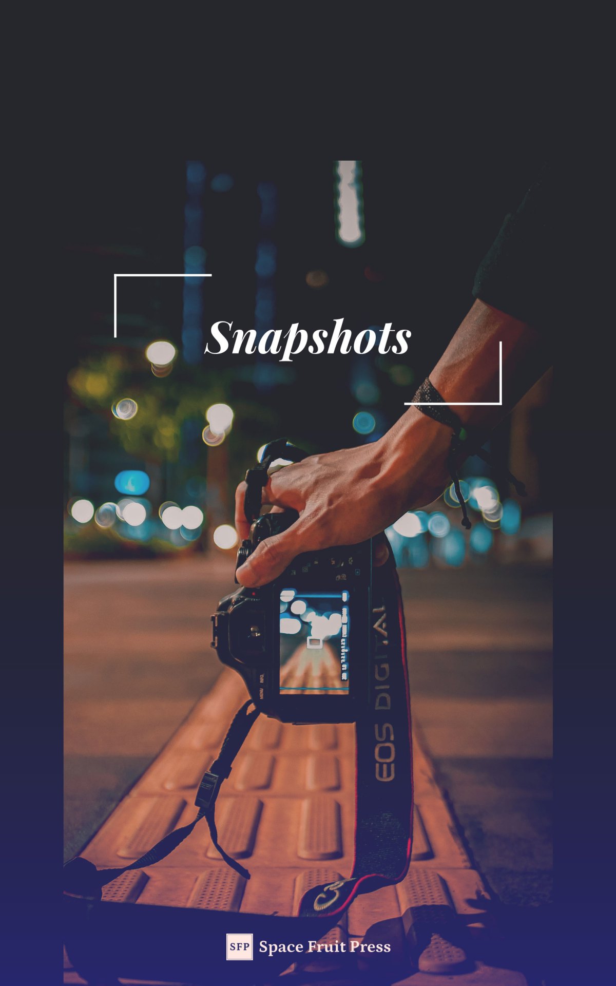
Other than those, I’m still pleased as punch with the cover for Snapshots. It’s more ~graphic, and the subtle color fade still gives me serotonin. I know I’m cheating by giving so many, but I think that Peach Season is probably one of the best covers, as simple as it is. Scouting for Reluctant Beginners has probably my favorite title typeface out of all of them.


SFP: How about those SFP logos! Did you have a vision going into designing those or … ?
SD: Oh my gosh, the work we all put into those! It’s funny—we ended up with so many different directions that we all liked so much, so I just went with it and created a style guide on how to use each one and when (covers, website, social icons, etc.) But it was still so hard to narrow it down to the five that we landed on. Probably bad branding on my part, but we’ll see how they fare over time. My favorite of course is our planetary logo, which you can see on our website header.
SFP: What is your dream design brief?
SD: “Take all the time you need. Here are the exact specifications of what we want. It’s for you to spend all your time painting and making book covers and printmaking and drawing and, sure why not, throw some ceramics in too. Here’s a million dollars.” Something like that.
In all seriousness though, I do like knowing exactly what’s being asked. I am allergic to vagueness. I start to panic if I don’t know what’s expected of me.
SFP: Where do you hope to see SFP in the near/far future?
SD: Among the stars! The dream is for SFP to grow and be able to support us all, and eventually other authors as well. I’d love for us to become a name that people recognize for queer content in the romance genre. I’ve always loved print and book design, so I would also love for us to eventually get into the printing game as well. Rachel does an amazing job now with typesetting all our books. If we got into print, that would open up whole other world of decisions we would get to make—about how a book feels in your hand, the layout, the cover front to spine to back. I love the idea of providing readers with whatever reading experience they want—if it’s an ebook, or a printed book, or even an audiobook. The heliopause is the limit.
